Independent graphic designer / Campaign systems / Hospitality visuals

Launch-ready visual systems for hospitality and lifestyle brands.

Campaign Kits / Menus / Posters / Identity Refreshes / Social Rollouts

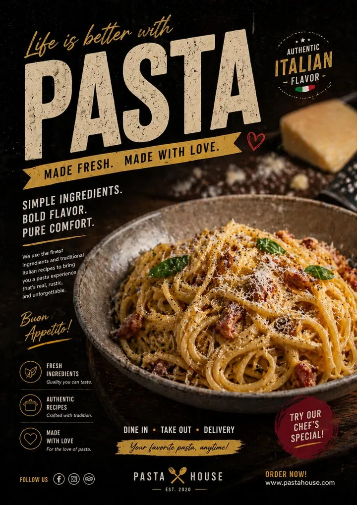
  • Pasta Hospitality Poster
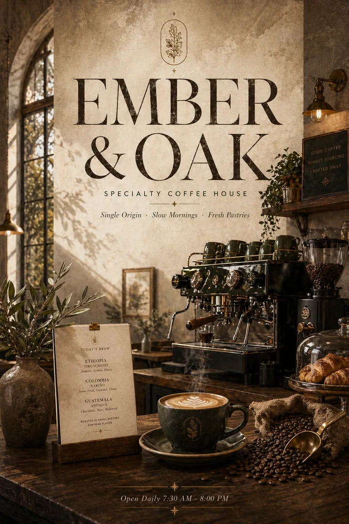
  • Ember & Oak Coffee House
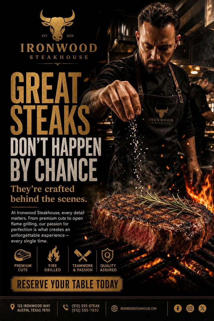
  • Ironwood Steakhouse Campaign
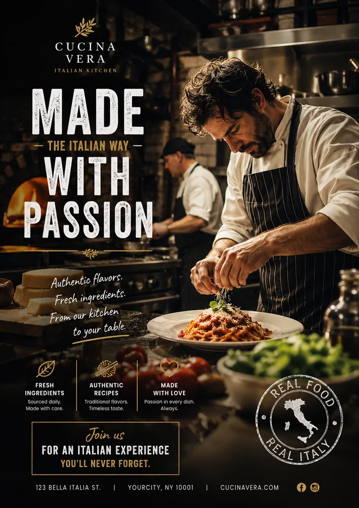
  • Cucina Vera Chef Campaign
  • Selected commercial systems

I shape the key visual, menu hierarchy, poster system, and social assets so your launch looks considered before anyone asks the price.

Send a Brief View the Work

For founders and brands that need a stronger visual system before launch, promotion, or repositioning.

  • Projects from HKD 5,000+
  • Campaign kits from HKD 15,000+
  • 24-48h first reply
  • Scope before design starts
Italian restaurant campaign poster with chef plating pasta in atmospheric kitchen setting.
Pasta restaurant poster with warm food photography and refined typography.
Specialty coffee house poster with warm lighting, espresso machine, and artisan craft atmosphere.
Steakhouse campaign poster with chef seasoning steak over open flame and bold gold typography.
Main artifact: chef-led launch campaign. Supporting slips show menu hierarchy, opening posters, and social-ready crops.
Opening-ready One visual direction, prepared for posters, menus, and social rollout.
Signature Showcase

A curated wall of launch-ready graphics.

Selected posters, menus, and campaign systems presented as working commercial artifacts, not decorative mood boards.

01 / 10
Pasta restaurant poster with warm food photography and refined typography.
W-01 Pasta Hospitality Poster
Specialty coffee house poster with warm lighting, espresso machine, and artisan craft atmosphere.
W-02 Ember & Oak Coffee House
Steakhouse campaign poster with chef seasoning steak over open flame and bold gold typography.
W-03 Ironwood Steakhouse Campaign
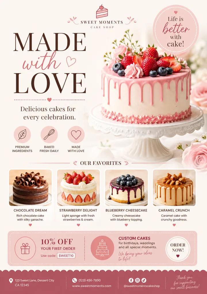
Bakery promotional poster with pink drip cake, strawberry toppings, and soft celebration branding.
W-09 Sweet Moments Bakery
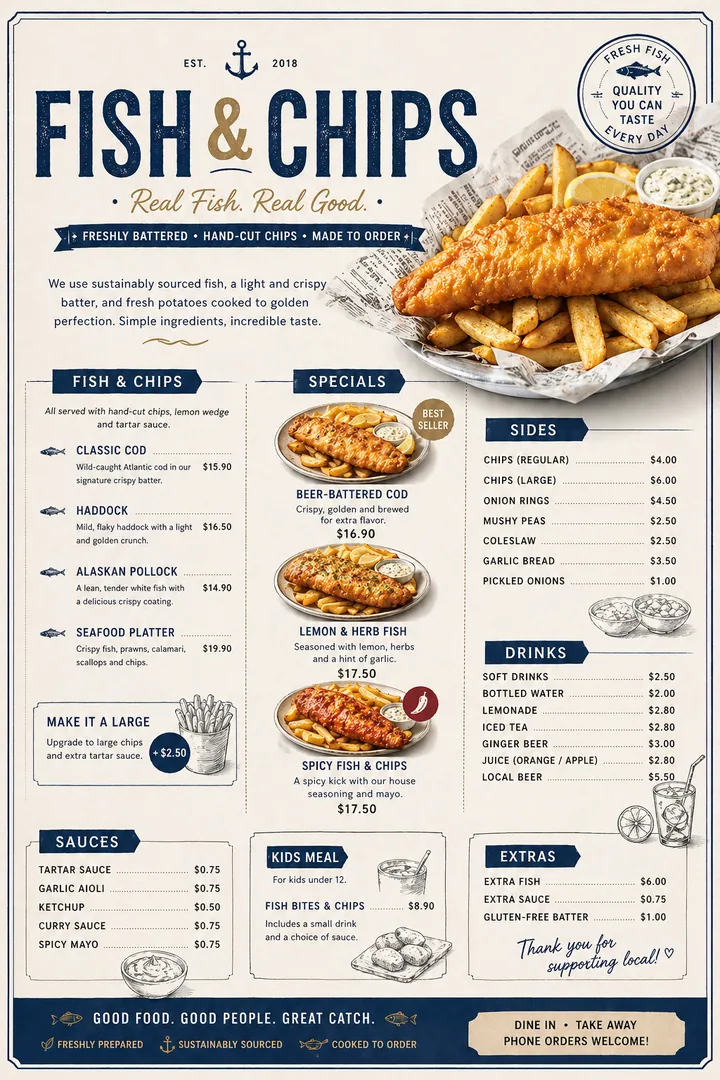
Fish and chips menu with newspaper-style layout, golden food photography, and structured pricing.
W-10 Fish & Chips Menu System
Menu-Led Campaign Pasta Hospitality Poster

A warm food visual built around appetite, hierarchy, and editorial restraint.

Problem
The offer needed to feel appetizing and easy to read at a glance.
Visual move
Warm food focus, large type hierarchy, and restrained hospitality details.
Output
Poster, social crop, and in-store campaign artwork.
Cafe Brand Atmosphere Ember & Oak Coffee House

A warm atmospheric cafe poster that turns a single-origin story into a visual world of craft and detail.

Problem
A specialty coffee concept needed craft and atmosphere before the customer visited.
Visual move
Soft light, serif restraint, and a full poster artifact with boutique pacing.
Output
Brand poster and mood-led launch visual.
Reservation Campaign Ironwood Steakhouse Campaign

A bold premium campaign poster that communicates craft, fire-grilled quality, and reservation urgency.

Problem
The steakhouse needed premium appetite and a clear reason to book.
Visual move
Dramatic fire, gold type, and direct reservation hierarchy.
Output
Hero campaign poster and social launch crop.
Chef-Led Launch Cucina Vera Chef Campaign

A dramatic kitchen scene that communicates passion, authenticity, and the craft behind every plate.

Problem
The campaign needed to make the kitchen craft visible before the offer.
Visual move
Cinematic chef photography with bold campaign type and trust cues.
Output
Opening poster, social feature image, and campaign key visual.
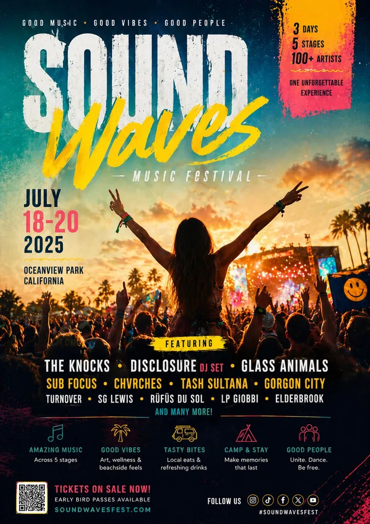
Event Campaign Culture Festival System

A high-energy event poster system shaped for immediate recognition and campaign reach.

Problem
The event needed fast recognition in a crowded culture feed.
Visual move
High-contrast energy, layered crowd imagery, and bold event hierarchy.
Output
Poster system and social event rollout.
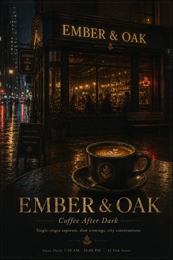
Evening Brand Extension Ember & Oak After Dark

A moody nighttime coffee visual that extends the brand into evening atmosphere and urban charm.

Problem
The cafe needed a second mood without losing brand warmth.
Visual move
Rain reflections, dark exterior glow, and quiet premium spacing.
Output
Mood campaign poster and social story artwork.
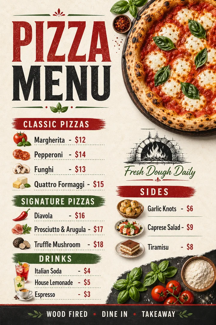
Menu Architecture Classic Pizza Menu

A vibrant wood-fired pizza menu that balances rustic warmth with clear ordering hierarchy.

Problem
The menu needed appetite and fast ordering clarity at the same time.
Visual move
Wood-fired imagery, structured sections, and warm rustic type hierarchy.
Output
Menu design prepared for print and digital browsing.
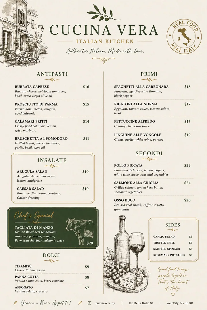
Fine-Dining Menu Cucina Vera Italian Menu

An elegant Italian menu combining hand-drawn illustration with clear category architecture.

Problem
The restaurant needed a menu that felt polished without making choices harder.
Visual move
Illustrated details, open spacing, and clear course structure.
Output
Print menu system and digital menu reference.
Bakery Campaign Sweet Moments Bakery

A warm bakery campaign poster that turns cakes into a celebration of craft, color, and indulgence.

Problem
The bakery needed a promotional visual that felt joyful but still commercial.
Visual move
Soft color, dessert focus, and celebration-led campaign type.
Output
Promotional poster and social campaign visual.
Takeaway Menu Fish & Chips Menu System

A structured takeaway menu that turns a familiar format into a clear, appetizing ordering system.

Problem
The takeaway offer needed structure, food appeal, and quick price scanning.
Visual move
Newspaper-inspired layout with golden food imagery and clear price groups.
Output
Takeaway menu and printable offer board.
Proof of Craft

Designed as working assets, not one-off decoration.

  • 20
    Selected commercial visuals across launches, menus, campaigns, and brand refreshes.
  • 3
    Clear entry points: identity, campaign assets, and hospitality graphics.
  • 24-48h
    Typical first reply after receiving a focused project brief.
  • 1:1
    Direct design execution, not template assembly or outsourced production.
Print-ready files Social rollout crops Menu hierarchy Direct 1:1 execution
Now Booking

Start with a sharper visual direction, then build only what your launch needs.

Starting point HKD 5,000+
First reply 24-48h
Best for Identity / Campaign / Launch
What Changes

Design should make the brand easier to choose.

The goal is not to make more assets. The goal is to make every asset feel clearer, sharper, and more useful at the moment someone decides whether to trust the brand.

Send a Brief
  • 01 / Recognition

    Your brand becomes easier to remember.

    A tighter visual system gives people a repeatable image of your brand, instead of a collection of disconnected posts and posters.

  • 02 / Trust

    The offer feels more intentional before anyone asks the price.

    Typography, spacing, image treatment, and hierarchy work together so the business looks considered from the first glance.

  • 03 / Sales clarity

    Customers understand what to look at first.

    Menus, campaign visuals, and social assets are shaped around decision moments: what it is, why it matters, and what to do next.

  • 04 / Roll-out

    You leave with assets that can keep working.

    The output is prepared for real use across print, social, launch pages, and future extensions, not just a single attractive image.

Selected Work

Work that sells the mood before the customer reads the offer.

This is not a random gallery. Each piece is designed for a real commercial moment: openings, menus, social campaigns, hospitality offers, events, and brand upgrades.

Discuss a similar project
  • Specialty coffee house poster with warm lighting, espresso machine, and artisan craft atmosphere. Cafe Brand Atmosphere
    W-02
    Ember & Oak Coffee House
    Cafe & Coffee Branding / Brand Poster / Specialty Cafe

    A warm atmospheric cafe poster that turns a single-origin story into a visual world of craft and detail.

    Output: Brand poster and mood-led launch visual.

  • Steakhouse campaign poster with chef seasoning steak over open flame and bold gold typography. Reservation Campaign
    W-03
    Ironwood Steakhouse Campaign
    Hospitality Visual Systems / Steakhouse Campaign / Premium Poster

    A bold premium campaign poster that communicates craft, fire-grilled quality, and reservation urgency.

    Output: Hero campaign poster and social launch crop.

  • Italian restaurant campaign poster with chef plating pasta in atmospheric kitchen setting. Chef-Led Launch
    W-04
    Cucina Vera Chef Campaign
    Hospitality Visual Systems / Restaurant Campaign / Chef Poster

    A dramatic kitchen scene that communicates passion, authenticity, and the craft behind every plate.

    Output: Opening poster, social feature image, and campaign key visual.

  • Music festival poster with crowd lighting, bold typography, and event campaign details. Event Campaign
    W-05
    Culture Festival System
    Music, Culture & Event Posters / Event Campaign / Poster System

    A high-energy event poster system shaped for immediate recognition and campaign reach.

    Output: Poster system and social event rollout.

  • Night-time coffee shop exterior with rain reflections, warm interior glow, and elegant dark branding. Evening Brand Extension
    W-06
    Ember & Oak After Dark
    Cafe & Coffee Branding / Mood Campaign / Night Visual

    A moody nighttime coffee visual that extends the brand into evening atmosphere and urban charm.

    Output: Mood campaign poster and social story artwork.

  • Pizza restaurant menu with wood-fired oven imagery, Margherita photography, and structured price layout. Menu Architecture
    W-07
    Classic Pizza Menu
    Menu Architecture & Offer Design / Menu Design / Italian Restaurant

    A vibrant wood-fired pizza menu that balances rustic warmth with clear ordering hierarchy.

    Output: Menu design prepared for print and digital browsing.

  • Italian restaurant menu with olive branch illustrations, wine sketches, and structured course layout. Fine-Dining Menu
    W-08
    Cucina Vera Italian Menu
    Menu Architecture & Offer Design / Italian Menu / Fine Dining Design

    An elegant Italian menu combining hand-drawn illustration with clear category architecture.

    Output: Print menu system and digital menu reference.

  • Bakery promotional poster with pink drip cake, strawberry toppings, and soft celebration branding. Bakery Campaign
    W-09
    Sweet Moments Bakery
    Brand Identity & Campaign / Bakery Poster / Dessert Visual

    A warm bakery campaign poster that turns cakes into a celebration of craft, color, and indulgence.

    Output: Promotional poster and social campaign visual.

Seen enough to shape the direction?

Send a rough brief and I will turn it into the right scope before design production starts.

Send a Brief
Services

Design support for moments that need to look ready.

Choose the level of design support around the commercial moment: identity, launch campaign, or broader art direction.

  • 02 2-3 weeks

    Visual Identity

    For brands that need to look polished, memorable, and instantly credible.

    A focused identity sprint for founders, restaurants, lifestyle brands, and personal brands that need a sharper visual presence.

    • Logo direction
    • Typography system
    • Color and art direction
    • Starter brand kit
    Shape My Identity
  • 03 4-8 weeks

    Art Direction

    For brands that need a complete visual world, not one-off graphics.

    A deeper design direction package for brands that want to move upmarket, look more mature, and build consistency across every touchpoint.

    • Visual strategy
    • Brand identity system
    • Campaign language
    • Launch kit and usage guidance
    Book Direction Work
Project Fit

Choose the path that matches the moment.

The best projects start with a clear commercial situation. If one of these feels close, the brief is already enough to begin a focused scope.

  • 01
    Launch soon

    You need the brand to look ready before the public sees it.

    Opening posters, social launch assets, menu or campaign graphics.

    Build a launch system
  • 02
    Look sharper

    The product is good, but the visual impression feels weaker than the offer.

    Identity refresh, type direction, color system, and brand touchpoints.

    Sharpen the identity
  • 03
    Sell clearer

    Your current visuals look busy, inconsistent, or hard to understand quickly.

    Menu hierarchy, offer design, poster systems, and reusable social layouts.

    Clarify the visual system
Process

A clear process, so the design does not depend on guesswork.

Every project starts with the audience, price position, use case, and sales context. The goal is not decoration. The goal is a visual system that changes how the brand is perceived.

  1. 01

    Read the Market

    We clarify your audience, price position, competitors, visual references, and the exact moment your customer needs to trust you.

    Output: Positioning / scope / timeline
  2. 02

    Set the Direction

    I build a visual direction with typography, color, image treatment, and a clear creative logic before production begins.

    Output: Moodboard / type system / art direction
  3. 03

    Build the System

    The approved direction becomes a usable set of posters, identity elements, social assets, menus, campaign visuals, or launch materials.

    Output: Core designs / extensions / export plan
  4. 04

    Refine and Deliver

    Final files are cleaned, organized, and prepared for real-world use across social, print, web, and launch channels.

    Output: Final files / usage notes / handoff
Good design does not decorate the brand. It clarifies it.

I design brand visuals for founders, restaurants, lifestyle businesses, creators, and campaign teams that need to feel clear, confident, and memorable.

Good design does not mean adding more effects. It means choosing the right type, image, hierarchy, rhythm, and restraint so the brand feels intentional in the first second.

The work is not a set of isolated graphics. It is a visual language your brand can repeat, extend, and be remembered for.

Before You Book

Clear answers before you send the brief.

A strong project starts when expectations are clear. These notes remove the common doubts before we talk about style.

  1. 01

    Do I need a finished brief before contacting you?

    No. A rough goal, timeline, budget range, and a few visual references are enough. I can help turn that into a practical scope before design starts.

  2. 02

    What files do I receive?

    Final delivery is prepared for real use: print-ready files where needed, digital exports for social or web, and organized source or guidance files depending on the scope.

  3. 03

    How are revisions handled?

    Revision rounds are defined before the project starts. The goal is to refine an approved direction, not restart the project from zero after production begins.

  4. 04

    What kind of project is not a good fit?

    Rush work without a clear decision-maker, projects that only need cheap template edits, or requests where the visual direction must be copied from another brand.

Start Project

Start with a clear brief, not a perfect brief.

You do not need a perfect brief. Tell me what you are launching, what feels weak visually, your timeline, and your approximate budget.

Best fit for founders, restaurants, lifestyle businesses, creators, and launch teams who need design that feels sharp, direct, and commercially usable.

01 Tell me the goal
02 I shape the scope
03 You get a clear next step
Project Intake Short, structured, enough to start.
So I know who I am speaking with.
If there is no final name yet, describe the project type.
Leave the easiest way to reply.
Choose "Not sure yet" if you need help setting the scope.
Budget range helps define the right depth of design work.
For urgent launches, include the hard deadline in the message.
Add the goal, hard deadline, current visual problem, and any references if you have them.